WeAreDevelopers World Congress - key takeaways
Published on 8/1/2023, 12:00:00 AM
WeAreDevelopers World Congress is one of the biggest IT events in Europe. This year I got to be one of the participants. Two days packed with talks on a wide range of topics in IT. I attended mostly those revolving around frontend development, green IT and accessibility. Here’s a quick summary of what I saw.
Sir Tim Berners-Lee's keynote
It started strong with a keynote by Sir Tim Berners-Lee, inventor of the World Wide Web. It was nice to hear his thoughts on the future of the internet - decentralized, safe and with data sovereignty, even though his ideas seem… a little bit utopian. I must say I took his words with some skepticism, but I get where he’s coming from. Great minds think big, so maybe my little brain is too overwhelmed with his ideas 😀
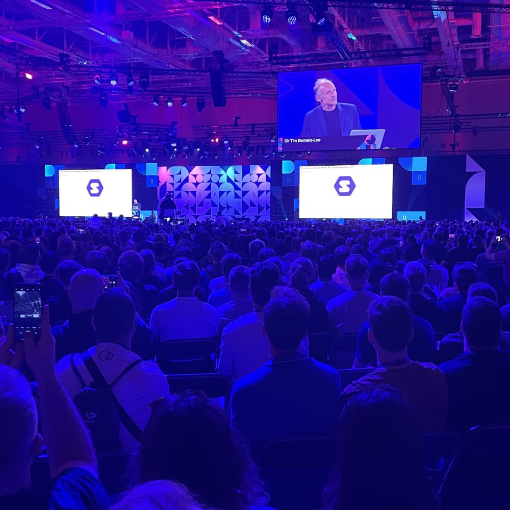
He focused on Solid API, the web standard of the future. I must say - all of this sounds compelling and I’ll dig deeper into the topic. Maybe then I’ll understand the hype. For now - take a look at it yourselves:
Fighting climate change with code
The two most interesting talks on the first day were revolving around green coding. Both “Reducing the carbon footprint of your website” by Ines Akrap (fantastic talk, it’s a pity it was so short) and “GreenCoding - Let’s build sustainable software to fight climate change!” by Tim Schade gave me a pretty good idea where to start and how to make our software “green”. Especially Ines’ talk was inspiring to me as she showed what can we do from the frontend development perspective.
That’s great - but what are the key takeaways from those talks?
First of all, it’s important to understand that Digital is not equal to Green. When talking about something being green we must consider the electricity usage, but also the source of electricity, time of day or country in which it is produced as the emissions differ quite largely.
Check this visualization on <s>Twitter</s> X
There’s a great article on calculating digital emissions on Sustainable Web Design’s website: Calculating Digital Emissions
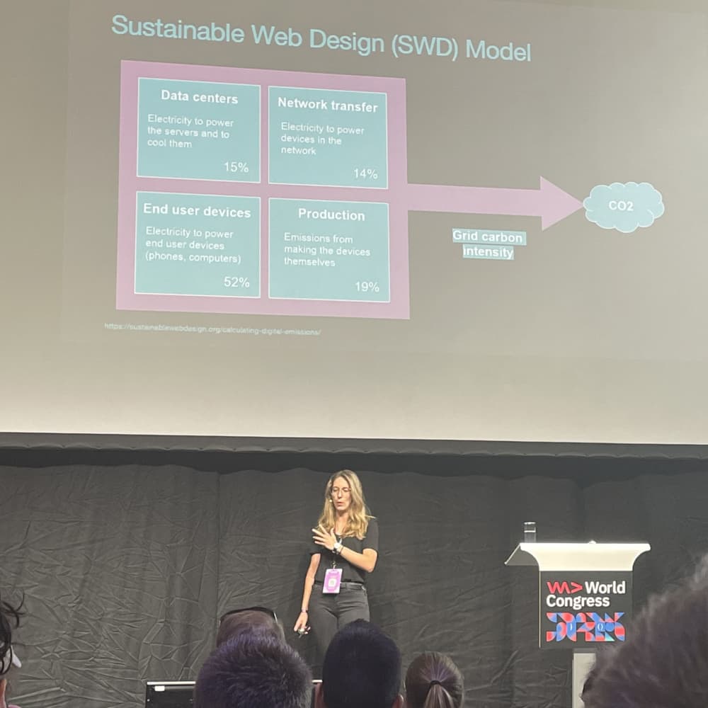
And how to reduce the website’s carbon footprint? Ines gave quite a few tips to do that:
-
using “green” hosting - check where your hosting provider has its servers, what kind of electricity sources are they using etc.
-
remove unused features
-
reduce the number of font files
-
use images of the proper size
-
disable autoplay on the videos on your site and (if possible) use a custom clickable thumbnail instead of a video player - that would speed up loading for most of the people that won’t watch the video
-
use caching and CDNs
That’s just a few tips, but even those can greatly reduce your website’s carbon footprint.
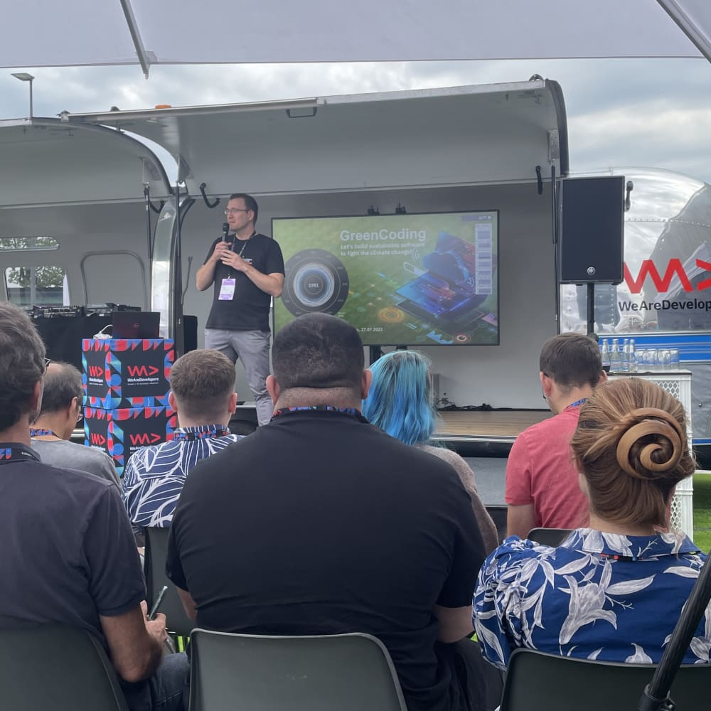
One question stands - why would you care? Your website is a drop in the sea, right? Well, even if one visit to your website generates several kg of CO2 - think how much it would generate after 1000, 10000 or even a million visits. Then the numbers start to become scary.
Applied Psychology: Psychology-based UI improvements
“Applied Psychology: Psychology-based UI improvements” by Keren Kenzi was a really fast talk on how psychology principles can make websites more compelling to the user. As it was only 10 minutes it was a brief introduction to the topic, but an interesting one. I’ll read about this more.
Breaking the bias in tech
Anna John’s story about changing careers and becoming an engineering manager as a woman was inspiring. She gave us some tips on how to fight biases in Tech, both as a privileged person (straight white male, hello) and as a person in the opposite situation (pretty much everybody else unfortunately).
The key takeaways for me are as follows:
-
Don’t be afraid to change careers
-
Set a goal and use failures to your advantage
-
Get better at saying no and setting boundaries
Saving the world and making it a better place
Hollie Gruber talked about our possibilities as developers to do something good. How to help non-profits using our skills? How to find a suitable beneficiary? What you can do? There is no simple answer to these questions, but you can make your search easier using one of the links that Hollie shared with us:
-
Impact Cloud - a platform that helps connect non-profits with big companies that can provide their services free or at discount
-
NTEN - non-profit networking community
-
Fast Forward - a place where you can find top tech non-profits
-
Good Tech Fest - conference on doing good in tech (happening both online and in Washington, DC)
-
NetHope Global Summit - another meeting place where you can find out how technology can help with making this world a better place
Hollie also showed us the UN’s 17 goals for sustainable development. It was the first time I came to know about it and I encourage you to learn more about it here: UN's Goals of Sustainable Development
It’s easy to create a good-looking product, but what about a useful one?
This talk by Eleftheria Batsou was in a nutshell about the differences between UX and UI, UX principles and do’s and don’ts. Well put introductory stuff, a good start for someone that would like to dig deeper into the topic.
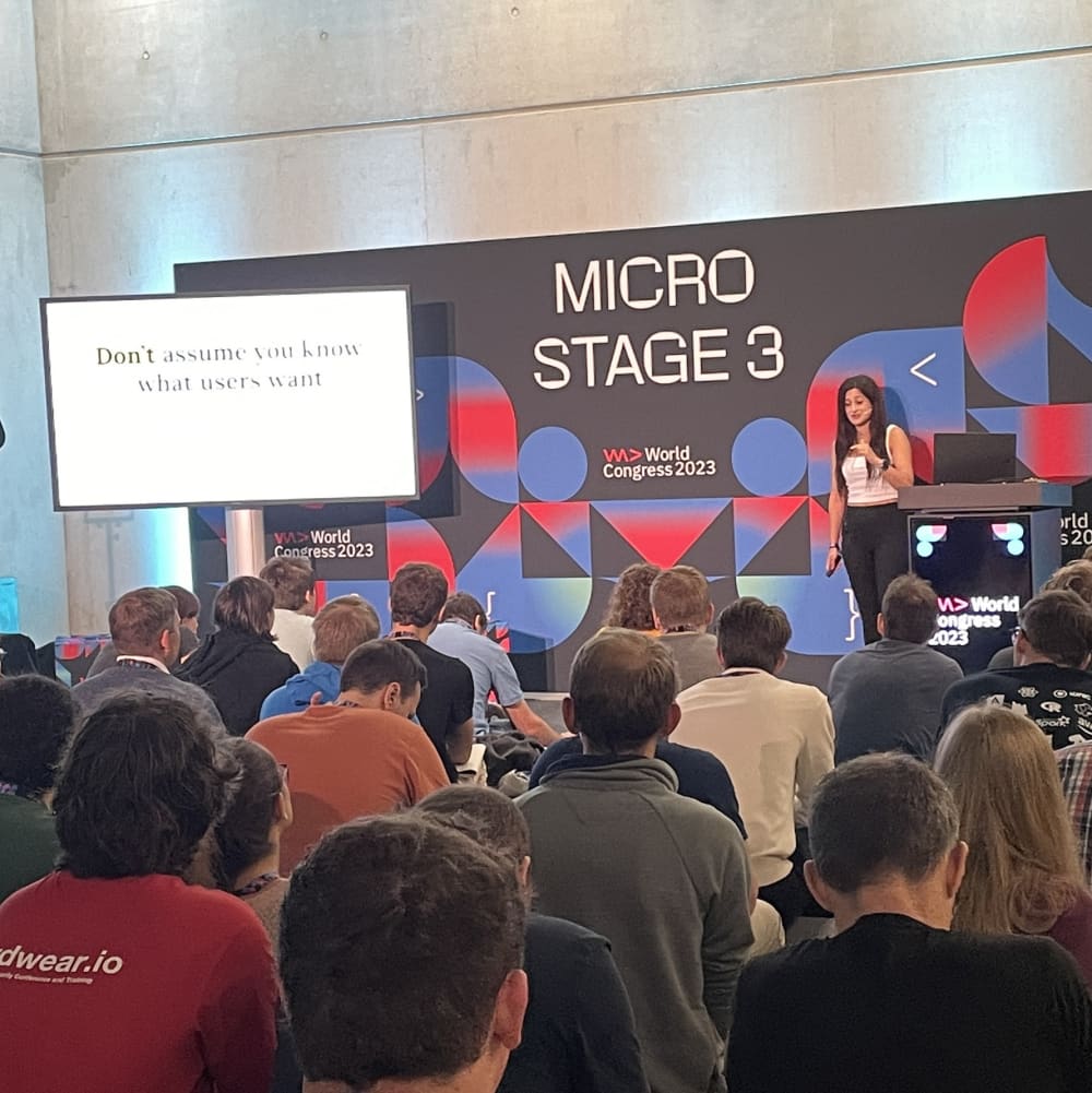
The most important takeaway from it though would be 10 usability heuristics for UI design - those were created by Jakob Nielsen and go as follows:
-
Visibility of system status
-
Match between the system and the real world
-
User control and freedom
-
Consistency and standards
-
Error prevention
-
Recognition rather than recall
-
Flexibility and efficiency of use
-
Aesthetic and minimal design
-
Help users recognize, diagnose and recover from errors
-
Help and documentation
They are great as you don’t have to be a UI professional to make use of those guidelines. You can read more about it on Nielsen Norman Group’s website
Accessibility with Web Components
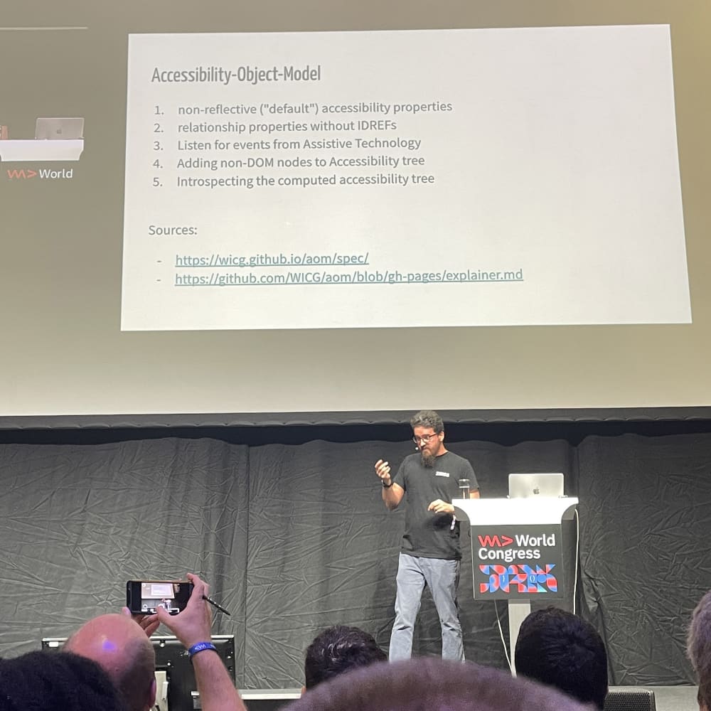
Talk by Manuel Mauky. I’m going to be honest - Web Components are not my cup of tea. I never worked with them and I never really had any interest in them. But lately, I went through a course on Web Components on Frontend Masters and I kinda see the appeal to use them. What I didn’t see was that accessibility could be an issue. Manuel’s talk not only made me aware of this but also provided me with solutions. Cool stuff!
From zero to hero: NextJS 13 and TailwindCSS for Beginners
Talk by Marius Obert. I know, I know, NextJS and TailwindCSS are all the rage now. I also jumped on that ship and I must say I like it. Both technologies (frameworks? libraries?) are really fun to work with. So why did I go to the talk that has “beginners” in its name? Well, NextJS 13 is pretty new - I wanted to get the view from the most modern perspective. And even though most of the stuff presented wasn’t new to me I still had a great time during the talk. Kudos to Marius!
Is it worth it?
100%. Two days of inspiring talks and networking. I liked it and would recommend it if you have the option to go there next year. If you are an IT professional you’ll find something interesting there. So, see you next year in Berlin?
